Making icons is witchcraft to programmers.
If your organization has awesome graphic designers in its payroll who understands iOS user interface designs, all is merry. Then you just need to focus on the programming. However in many cases the situation is not ideal:
- The boss hired a Photoshop jockey from a print media background who doesn’t understand what pixels are.
- A hire for mobile UX turned out to be poached from an independent consulting firm whose previous job was essentially designing web sites – thus had no awareness that certain assets are expected to be in certain dimensions and each needs to be delivered at varying resolutions.
- There’s a PhD “UX Expert” who is great at A/B/C testing as well as writing and quoting academic papers. However this expert can only draw buttons as text in rectangles and not much more.
All three of the above had happened at various times in my corporate career. On top of that, the second case (the web designer hired as mobile UX) seems common outside Silicon Valley. If this happens to you as well, it would be your duty as an iOS-native developer to enlighten your colleagues to the sublimities of the platform.
There could be more situations in which won’t be able to depend on reliable and capable graphics designers to create icons for you. Examples include being a solo founder or maybe working in a tiny startup which hasn’t secured enough funding to hire a good graphic designer. In these cases, your best solution to providing app icons could be to fish them out of various icon sets that you’ve found on the Internet (licensed or otherwise).
Unfortunately cobbled-up assets from varying sources won’t look good together. If you’re making an iOS app and obtain button glyphs from heterogeneous sources, there’s a 99.99% chance that your app is going to look like patchwork. That’s because these buttons came from differing artists, and they have their own respective styles of drawings.
To make the toolbar buttons, tab bar buttons, or any other glyphs in your app to be in harmony, you would need to do one of these things:
- Spec all of the buttons and have them done by the same artist — or at least the same group of graphic designers who communicates with each other and can see the bigger picture.
- Draw all of them by yourself, hence making sure that they adhere to the same style and have the same grid.
Even if you work for a well-funded company, sometimes things happen and the designers that you end up with doesn’t really get iOS. In both of these cases, you will need to have a good grip of the design process. Either to do it yourself or to meet your designer colleagues “halfway” and help them understand the nuances of designing for iOS.
“But developers can’t create graphics,” you might thought. Relax. All skills can be learned. Besides, you’re not trying to compete with Picasso or Dalí here, but create graphics that are useful and would look good enough for your app.
Here’s a step-by-step walkthrough on how a developer can create glyphs for iOS apps. Making button icons is not witchcraft, but not fully science either. It’s a combination between art and engineering — not that different to programming software.
![]()
Prerequisites
- You need to have a clear idea of the functionality behind the button.
- You need to be already familiar with a vector-drawing app that can make pixel-perfect exports.
Process Description
These are the general steps that you should follow for each button image. As these are generic, I’ll be providing an example in the next section.
- Brainstorm keywords that describes the underlying functionality. Try to find a list of short English phrases (ideally just one word, but 2–3 words are okay) which users would use to describe what the button does.
- Search the web for those keywords to find what shapes are associated with them. My favorite places to start are flaticon.com and findicons.com. However, failing those then you can go for Google’s image search as well. Remember that you’re just looking for shapes and not the final image. Pick the image that is most descriptive yet simplest (meaning has as few details as possible) as the model image. Remember that these are to be used as thumb-sized images, hence details would often be lost.
- Lookup the iOS Human Interface Guidelines (HIG) for the image’s size as well as any specific concerns that you need to take care. Take note that toolbar buttons, tab bar buttons, and navigation bar buttons have their distinct image dimension requirements.
- Find an icon grid and use this grid consistently throughout the app. You can use the many freebies iOS icon grid or even the placeholder icon that the Springboard uses when an app does not have an icon. My personal favorite icon grid is MartianCraft’s Yosemite Icon Grid, specifically the square icon version for use with toolbar buttons and the circle icon version with tab bar icons.
- Create a template file for all of the icon glyphs of your app for the same type. For example, create one template file for all toolbar icons and another template file for the tab bar icons. Thus when creating an icon glyph you would always start by duplicating the appropriate template file.
- Fire up your favorite vector design app.
- Create a drawing for the target icon size at
1xresolution point size. This would be 72dpi vector images. - Underlay the icon grid into a non-printable, non-exportable layer and resize it to the full drawing surface.
- Using both the icon grid and the HIG as a guide, create guiding lines for the baseline and cap height. The vertical middle is usually the median line whereas the ascender height is the topmost of the image. Remember that you are really creating a custom character that symbolizes the functionality behind the button, thus the metrics coming from typography design. However in glyphs, descenders should be tiny.
- Duplicate the template file for use as the button image file. You should name the file as how you intend to refer it in code. This would make it easier to find and update later on.
- Paste the model image that you’ve discovered earlier. Place it in a non-printable, non-exportable layer as well. This would function similar to the icon grid.
- Trace an outline of the model image using 1-point black lines. You are creating a black-over-transparent image. Since iOS 7, button glyphs should consist of thin geometrical lines, hence you should follow this when you are redrawing the model image.
- Fill the dark colored areas of the shape as black. Similarly you can also have gray fills as semi-transparent black fills. Do not include any other color.
- Finally export the image into
2xand3xversions at 144dpi and 216dpi respectively. - Optionally duplicate the image and create the inverse of the glyph. This is where black areas becomes transparent and vice-versa. Take care to keep the outline shape identical (that is, do not not change the basic shape) and don’t fill the background of the image. Do this only if you don’t like how iOS inverts the original image when the button is tapped or the tab bar is selected.
An Example
Now let’s put those above steps into action. This was the process that I followed when creating glyphs for my Speech Timer app. I’ll show an example of drawing a tab bar icon for regular-sized tab bars of the timer tab.
My favorite app for this task is Affinity Designer, and would be using the idioms of the app in my description. However you should be able to follow the directions using your favorite vector design app.
Brainstorming Keywords
The timer tab contains the main functionality of the app, which is to measure how long a speech takes. Thus its keywords are simple:
- timer
- stopwatch
Searching for Shapes
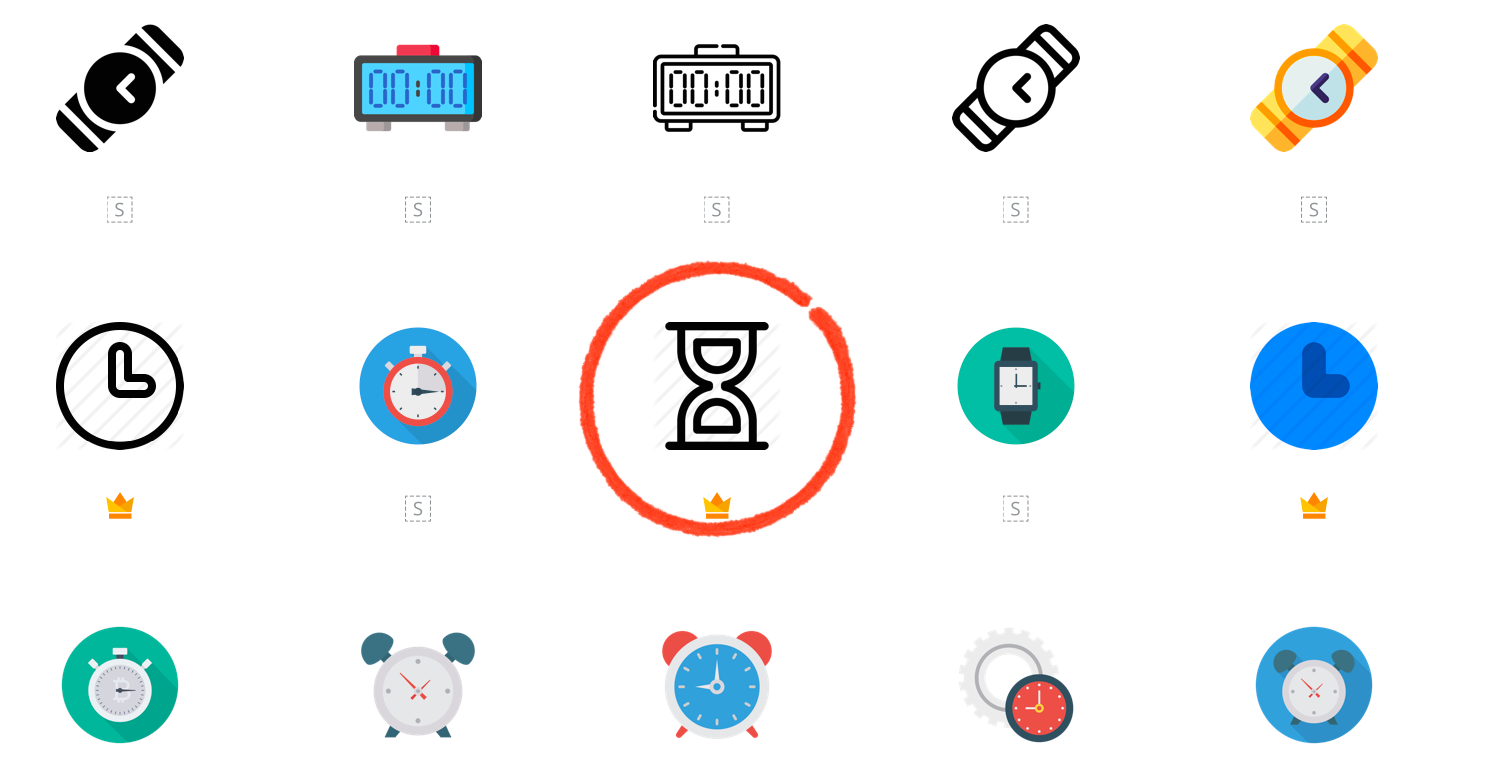
Searching for the word timer in flaticon.com mostly shows pictures of analog clocks, analog watches, or variations thereof. I feel that these would require too much detail to be placed as a tab bar icon — I needed a distinctive shape which represent measurement of a finite time that can “run out”.
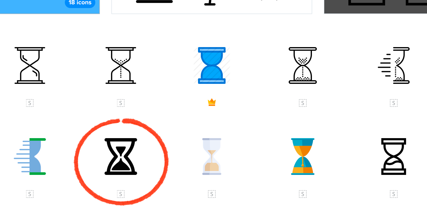
Thankfully after a few scrolling, I found a picture of an hourglass or sand clock. This has the distinct shape that I need as well as similar characteristics of a timer, in that it measures an amount of small finite time measurement.

Getting the Dimensions
The Custom Icons section of iOS HIG states these are the dimensions of a regular tab bar icon:
- Drawing surface: 31pt wide, 28pt high.
- Inner square size: 23 by 23 pt.
- Inner circle size: 25 by 25 pt
From that, I created an artboard of 31×28 points at 72 dpi. I’ll be drawing the image at 1x and relying on Affinity Designer to create the 2x and 3x variants from this.
The Grid and Template
I’ve used MartianCraft’s circle icon grid for this one. Based on the grid and the HIG, I’ve placed these horizontal guides:
- 1 pt at the top as the ascender.
- 3 pt as the cap height.
- 25 pt as the baseline
Those measurements are based on an inverted cartesian coordinate in which point (0, 0) is the top-left position.
I’ve created a special layer for the grid called Tracing then set the layer to 50% opacity and a composition mode of Difference. I quickly switched over to the Export Persona and made the layer to be non-visible in export — to prevent from accidentally including the grid in the final image.
![]()
The Model Image
Having selected an hourglass as my shape, I then searched flaticons.com and select the simplest yet still attractive black-and-white hourglass symbol that I could find. Then I’ve pasted it into my Affinity Designer file just above the icon grid in the same non-exportable layer. Finally I’ve resized the model hourglass just so that the bottom surface is at the baseline guide.

Re-Drawing the Hourglass
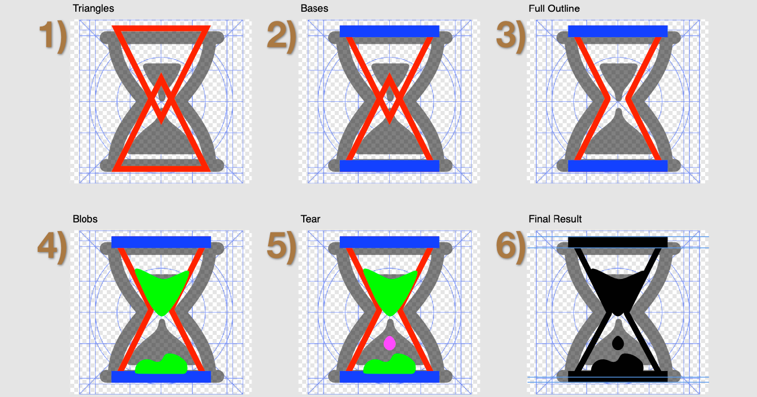
To match the geometrical shape look of iOS icons, I’ve re-drawn the hourglass shape using two isosceles triangles opposing each other and overlapping at the sharp angle. These triangles are 1-point thick outlines. Then at the two bases (bottom and top), I’ve overlaid the short sides of those triangles with two-points thick rectangles, signifying the reinforced top and bottom surfaces of the hourglass. Finally the two triangles are merged together to create the hole in the middle of the bulb in which the “sand” can pass through.

It occurred to me that present-day hourglasses doesn’t use sand. Instead they usually uses colored liquids with differing densities. Thus I drew the content of the hourglass to be “blobby” which is a nod to these oil-glasses. These were done freehand using a Wacom Intuos graphics tablet. (On a side note, most hourglasses nowadays don’t measure an hour either but usually three minutes instead — but let’s save that for another topic.)
Creating the Inverse
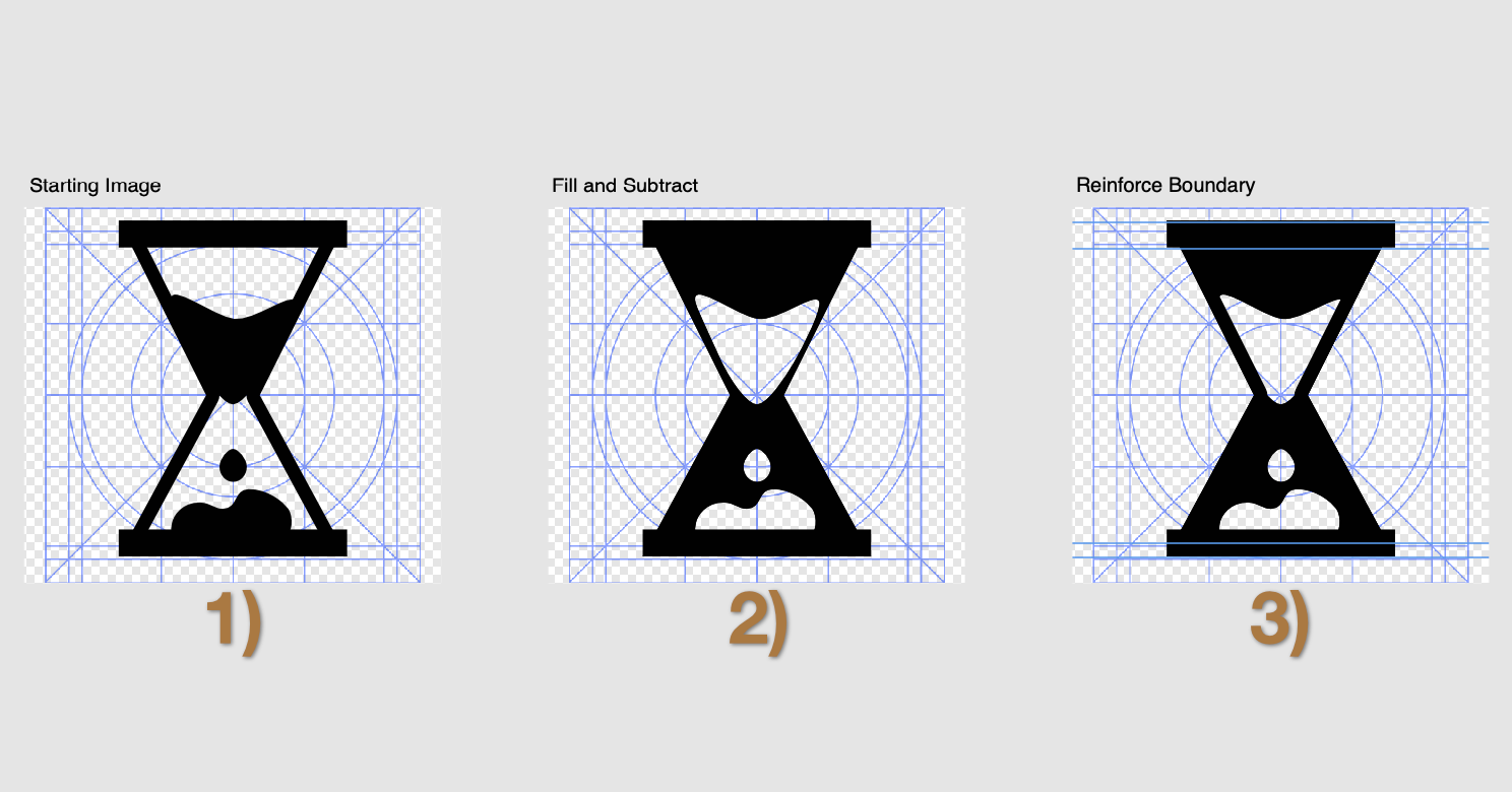
The inverse of a tab bar icon would be shown when the button is in a selected state and the corresponding tab is active. Hence I wanted a mostly black image without changing the background nor changing the basic shape of the icon. To do this, first I’ve set a black fill to the hourglass outline — the merged two triangles. Then I’ve set the oil blobs inside to be subtracting the outline.
But notice that the blob is eating away the outline. Upon entering pixel view mode makes this problem even clearer — the outline becomes too thin and blurry (this pixel view mode is also why Affinity Designer is suited for this task). This is easily fixed. Just duplicate the original outline (the one coming from two triangles) and move it as frontmost, take care to remove the fill and set the outline color as black. This would cover up the outline containing the blobs and would serve to reinforce the viewer that the “glass wall” still exists.

Getting the Bitmaps
Last but not least, export the 2x and 3x versions of the image as PNGs, which is ready to import into Xcode’s Asset Catalog. Finally test it out inside a real tab bar using the iOS Simulator. In the screenshot below, I’ve placed three tab items, the first two are the timer images drawn in the post and the last one is iOS’ built-in “Favorites” tab bar item for comparison. The tab in the middle is selected, hence showing the “inverted” version of the icon.

The image above was taken from iOS Simulator screenshot, imported into Affinity Designer, and zoomed in with a bit with gridlines displayed. Furthermore I’ve placed guidelines to check that the “baselines” of our new icons align well with the built-in ones.
Challenge Yourself
Now that you have an idea of how to make button glyphs, it’s time to take some practice shots. Challenge yourself to make glyphs as practice before you need to put the skill into a production app. Here are some ideas to get you started.
- Re-do some of iOS’ built in app’s button glyphs from memory — not by taking screenshots and tracing them. Take a button, remember what it does, search the web for other icons which matches the keyword descriptions, and re-do it to fit iOS’ style.
- Re-do some of Apple’s own apps’ button glyphs, again from memory. Then compare with a screenshot to the original one.
- Take a look of the glyphs of cross-platform apps that you had to use often. Your banking app would likely be a good candidate for this. Compare and contrast the styles with iOS’ built-in apps. Then see if you can do better.
By the way, you can download the Affinity Designer file containing the finished icon from here: BSTImerTabBarIcon.zip
0 thoughts on “How Developers can Draw Icons for iOS Apps”